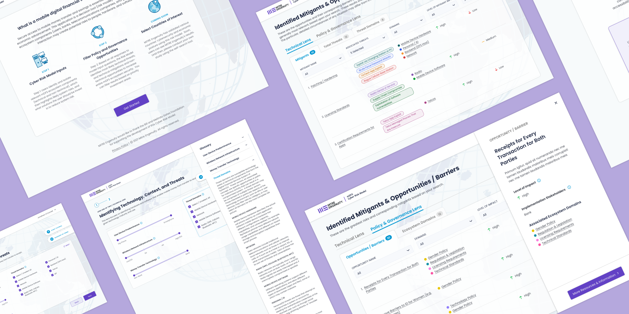
A tool for identifying salient cybersecurity threats and mitigation strategies in developing nations

Introduction
Project Role
UX/UI Designer
Project Duration
4 Months
Responsibilities & Outputs
Product and User Research
Information Architecture
UX Strategy & Wireframing
Prototyping & User Testing
Visual Design
Tools Utilized
Sketch
InVision
Adobe Illustrator
Miro
Zeplin
Tech foundation MITRE Engenuity came to 10Pearls with their idea for a tool to help NGOs, international organizations, and governments identify cybersecurity threats in developing nations and tactics to combat them. Marrying their deep expertise in the technology behind cyber threats and security measures with their expertise in non-technological policy measures and interventions, they aimed to guide users towards making the world a safer place.
Their ultimate goal was to create a web-based tool for users to view threats and tactics based on their own individual missions, for example improving security of financial apps for women in North African countries. As the main designer on this new product, I led the efforts in the following areas:
Discovery and Research
Content Strategy & Information Architecture
UX Strategy, Wireframing, Prototyping & Testing
Visual Design
Research & Discovery
Understanding the problem space and end user
The MITRE team had a wealth of information available to their users, but needed a simpler way to parse through the data and demystify the information. In order to lay the groundwork for my design decisions, I conducted discovery workshops with our clients that included:
Interviews with key stakeholders from both technological and non-technological expertise
Research into the current platform and MITRE’s internal research
Interviews with target audience
Identifying key insights
Following our research workshops and interviews, I took away several main takeaways:
Background knowledge
The end users may not understand all of the information available to them, especially the more technological side of the product and content.
Data visualization
MITRE’s internal research and data was vast but the relationship between their data and visual display was confusing to non-experts.
User availability
The end users are very busy with competing tasks, and do not have much time to learn a new tool and how to use it properly.
Creating a persona
To contextualize our end user, I created a persona to guide the team’s approach to the strategy and design process.
UX Strategy
Mapping the user journey
With these insights and end user in mind, I began to piece together the user journey through the tool from landing on the tool to the end goal of finding research on individual security tactics and threats relevant to their missions.
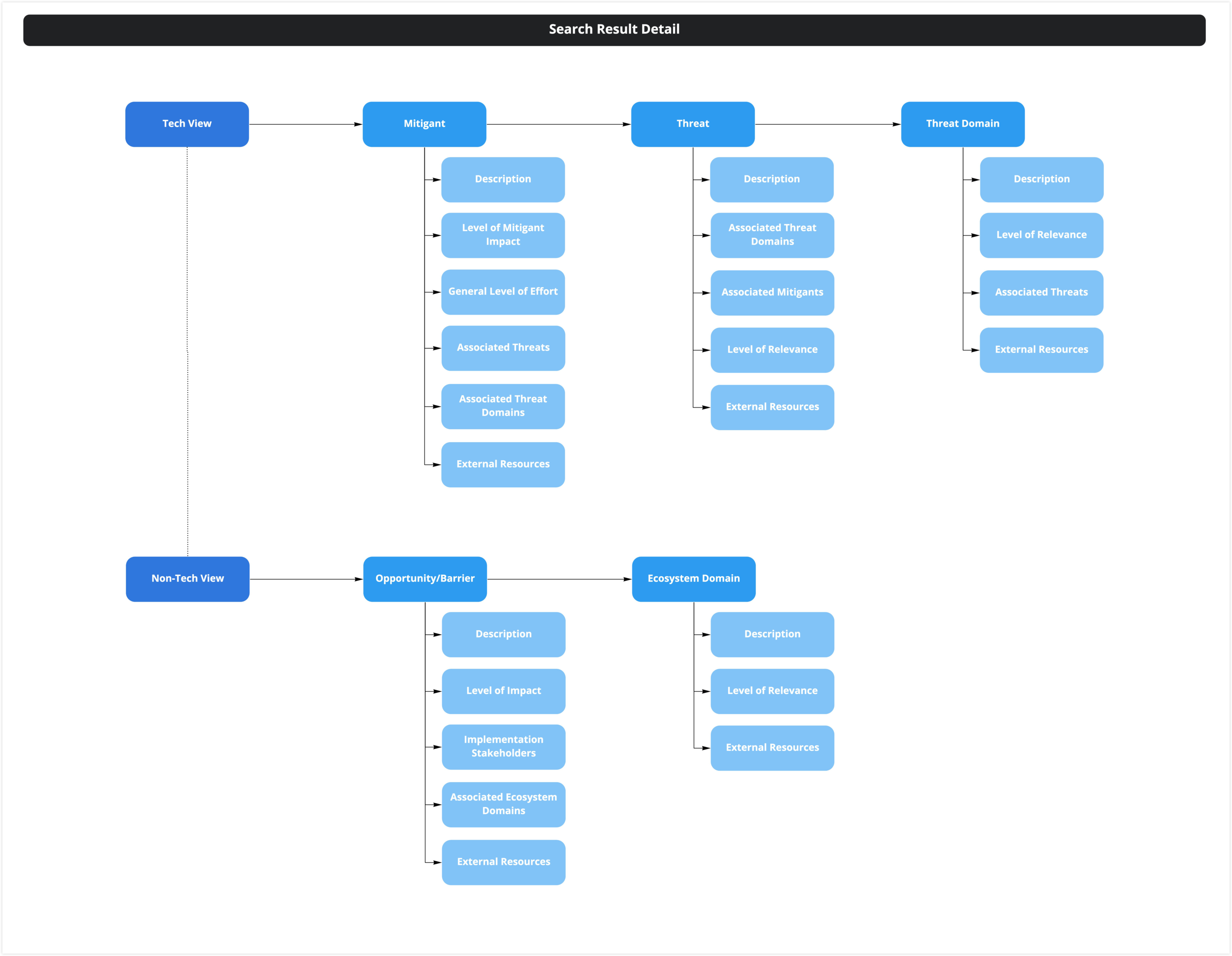
Defining the information architecture
In order to organize the information displayed, and content the client would need to provide, I drafted a sitemap to arrange the levels of information needed for each step of the process.
Building a prototype
With the user journey and content strategy in place, I created medium fidelity wireframes to validate with key stakeholders and refined a number of times until the team was confident with the user experience.
This process involved iterations in close collaboration with the clients, fellow designers, and our engineering team.
Refinement & Visual Design
Refining the initial prototype
The previous work was accomplished in a 3-week time period, concluding with the medium-fidelity prototype. After a pause, we resumed our collaboration with MITRE Engenuity to fully design and develop the product.
Following the break, MITRE Engenuity identified a few key changes we would need to account for in our design.
Country selection tool was no longer possible and would need to be removed from the process
The tool would require users to input search parameters for both the technological and non-technological lenses of the tool
The planned interactive tutorial was not possible to develop for the client’s deadline, so we needed an alternative design for a guide feature
Creating a design system
Leveraging the existing brand guidelines, I introduced a UI system to guide the development of high fidelity designs.
Implementing the visual design
With everything in place, I applied the design system to the new product for a high fidelity prototype.
Validating the design
By testing the high fidelity designs with stakeholders, my design team, and end users, I was able to identify problem areas and refine the design to account for any confusion or pain points in their experiences.


