A mobile app for book club facilitation and participation encouragement

Introduction
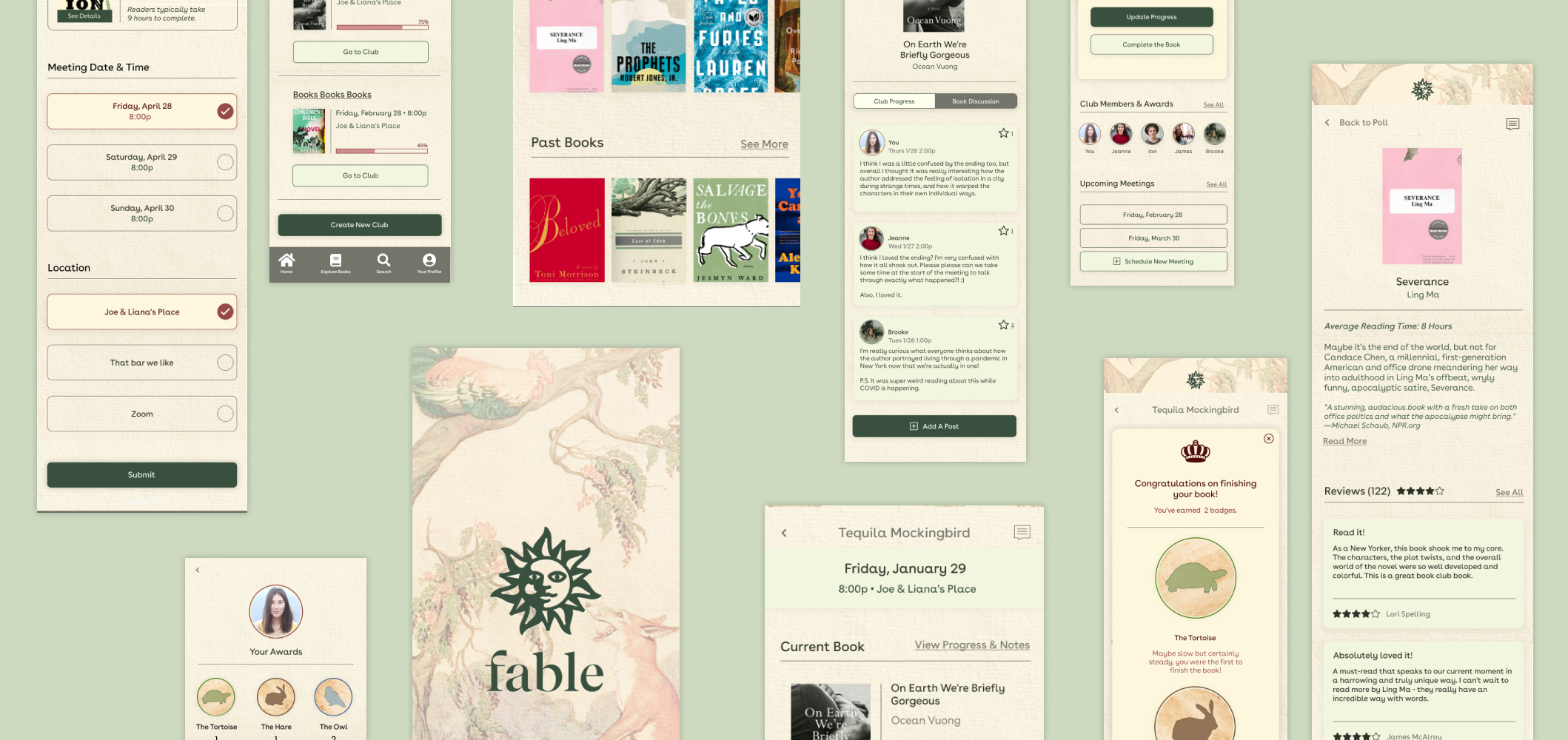
Book clubs are a great way for people to bond over a shared love of reading, but can be difficult to facilitate and manage due to schedules, decisions around what to read, and encouraging participation. My app is designed with a number of tools to encourage readers to stay engaged with their readings and club.
Project Role
UX/UI Designer
Project Duration
4 Weeks
Responsibilities
Market and User Research, Interaction Design, Wireframing, Branding, Visual Design, Prototyping, User Testing
Tools Used
Figma, Illustrator, Whimsical, Maze
Research & Discovery
Planning my research
To familiarize myself with the problems facing book clubbers, I created a list of questions to guide my research.
Who are the book clubbers? What do they like about book clubs?
What are their book clubs like? Who else is in them? How many people? How often do they meet?
How do the clubs schedule their meetings?
How do the clubs select the books they read?
Do they have experiences with failed book clubs? What led to their disbandment?
What platforms do the participants use to communicate and facilitate their meetings?
Building a persona to ground design decisions
Based off of the learnings of my interviews, I created a persona and corresponding empathy map to personalize my intended user.
Interaction Strategy
Addressing the main problem at hand
With the research complete, I took another look at the problems my participants were facing and wrote some problem statements to begin the ideation process.
How might we encourage book club members to read the book?
How might we make it easier for members to organize their notes for an upcoming meeting discussion?
How might we create the best polling process for members to vote on scheduling and book selection?
How might we help members keep track of their past books?
How might we help members keep track of books they would like to read?
The value in my app would be solving the main problem at hand: Book clubs lose their fun, and ultimately fail, without active and eager participation.
Proposing multiple solutions
I began brainstorming various ways that my participants had mentioned they liked to prepare for their meetings, and ways that they became frustrated when others did not. I decided to encourage participation through 4 different ways:
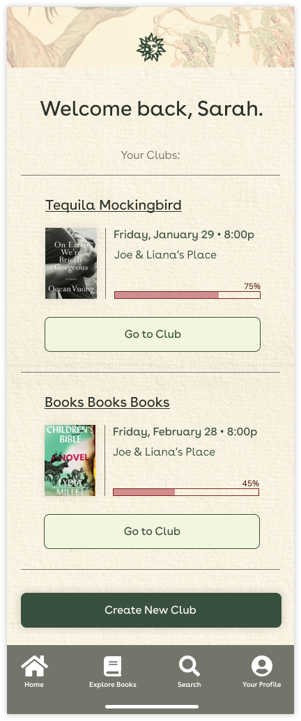
Increase reading motivation by surfacing public reading progress
Deepen investment of members in the club through voting systems
Facilitate and preempt conversations with discussion notes
Reward members for participation
Organizing the app’s content
Mapping out the user journey
Rapid iteration and storyboarding
Testing a low fidelity prototype
With my design choices in place, I built a low fidelity prototype to test live participants’ interaction with the tool. Using the Maze platform, I tested users’ ability to complete three tasks within the app:
Cast their vote for the next meeting
Add their reading progress and note for the current book
View members’ individual awards and read more about an award they’ve won
Branding & Visual Design
Creating a brand
I set out to create a brand that celebrated reading and communicated a spirit of whimsy and adventure associated with reading. Through some creative concept brainstorms, I found myself inspired by the aesthetic of vintage storybooks, in particular by illustrations and old publications of Aesop’s Fables. I gathered inspiring visuals to form a mood board.
Applying the design system
I then created a design system for the interface. My goal was to create a design system that married the modern with the antique aesthetic, utilizing a paper and letterpress texture complemented by white space and grid-structured content.
Testing & Iteration
Testing a high fidelity prototype
After two rounds of 1-on-1 testing with participants, I identified more areas that needed iterations from both UX and UI perspectives.
A sizeable number of participants associated the maroon brand color with an error alert
The path to the “Current Book” page was not clear
The “Next Meeting” information bar on the club page was often overlooked
Finalizing the design
With my edits prioritized, I made some final adjustments to the design in order to solve for the problems addressed by my users. These included limiting my color palette, clarifying CTA copy further, along with other smaller tweaks.


